One of the downsides of specialising is leaving behind areas of knowledge you used to love. As I have specialised in the programming side of web development, I have found myself getting further and further away from working with HTML and CSS, and letting my markup skills get rather rusty.
Of course, over the last couple of years, all sorts of exciting things have been happening with HTML and CSS, as browsers implement more features of HTML 5 and CSS 3, and the skills and techniques I used to be able to boast of are now anything but cutting edge.
So I thought I should do something about it, and there’s no better way to deal with something like this than to have a good play around. The following pages are rendered entirely using HTML and CSS; no images were harmed in the preparation of these pages.
Note: these pages render correctly in Firefox 3.6 and Safari 4.0.4. They probably don’t work in older versions and are most definitely NSFIE.
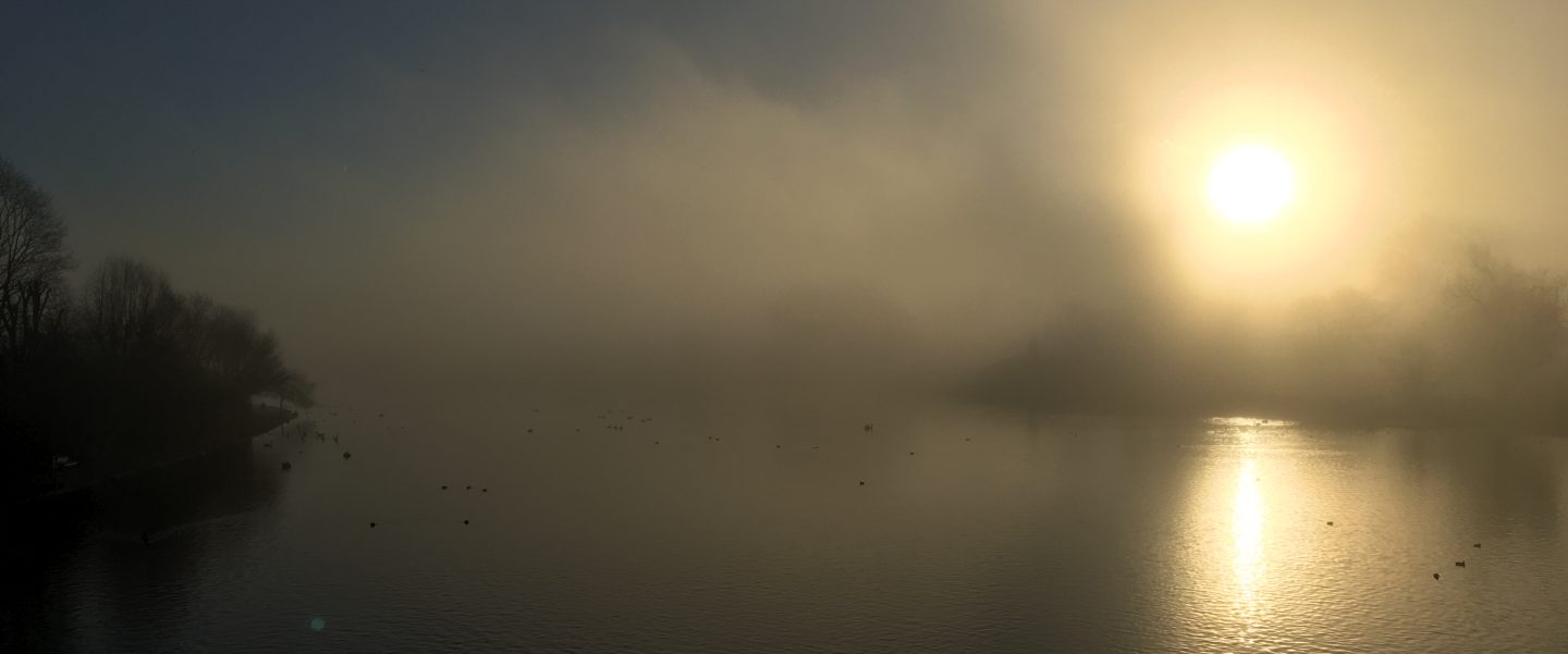
Landscape
First, then, I thought I would have a bit of a play with web fonts, gradients and transformations. Here’s the result:

http://playground.matthewbutt.com/landscape.htm
It took a little adjustment to get the rays of sunshine correctly positioned: the key was to position the transform origin at 50% of the height of the text.
Constructivism
Next I thought I would try my hand at a little faux-constructivist design. The simplicity and clear colours of constructivist design are perfect for online material, but the jaunty angles have always posed a major problem: either render the text as images, or give up. With CSS 3’s transformations, this is no longer a problem, and there’s scope for a Russian revival:

http://playground.matthewbutt.com/construction.htm
Again, getting everything to line up took a little getting used to, and it boiled down to the same issue: getting the transform origin of every element in the same place, and then rotating around that point.
A real-world example: Magazine’s Touch and Go
Ok, my constructivist sketch isn’t exactly high design, so I thought I would find something that had already been done, and have a go at copying it.
Here is the cover of Magazine’s 1977 debut single, Touch and Go:

And here is a quick HTML version:

http://playground.matthewbutt.com/magazine.htm
The only advanced technique here is the use of web fonts, although I’ve made liberal use of the :nth-child pseudo-class to apply styles to the coloured panels. I have to confess to using a few non-essential spans for this one, but I think the result is pretty pleasing for an image-free page.
And that’s my lot for today. There’s plenty more excitement in the latest implementations of HTML and CSS, so I’ll post some more experiments when I have a moment.
Acknowledgments
Fonts
- Landscape and Construction use Blackout Midnight by the League of Moveable Type
- Magazine uses Great Primer, which is one of the Fell Types digitally reproduced by Igino Marini
Books
- Walsh, Gavin (2006). Punk on 45: revolutions on vinyl 1976–79. London, Plexus. ISBN-13 978-0-85965-370-1
 Matthew Butt
One thought on “Look mum: no images!”